Widespread implementation of responsive web design (RWD) is relatively new in the design world, and though it’s gaining steam, the perfect method of implementation has yet to make itself known. Often designers are on their own in their efforts to figure out how to gracefully degrade the fancy features in their client’s websites, while still prominently featuring the most important content.
Nobody said it’d be easy, but the front-end UI development has never been more complex.
Still, it’s not at all impossible to create beautiful designs that translate attractively to smaller screens. In fact, there are at least 21 different exemplary instances of companies, publications, corporations, or individual designers doing just that.
You can tell where this is going right?
Below you’ll see excellent examples of website’s that look downright dazzling on a big screen, and yet retain their most important components as viewports decrease in size. You’ll even see a few that preserve animated effects, transitions, and the oh-so-rare: parallax effects on mobile.
But we’ll start simple with a few text heavy websites that rely on white space, typography, and minimalism to make their point, without as much in the way of distracting imagery.
Less is More

From left to right, a shot of the web page in a smaller browser window, and on a mobile device. Note that you haven’t really lost any of the most relevant elements from the big view. The text has shrunk noticeably, but remains legible, and the menu button stays visible in place of the original header, to ensure easy navigation. Highly usable, and it still effectively communicates the desired message.
The rest of the examples in this section follow the same formula.


3. Kissmetrics


A Little More is Nice
Simplicity is all well and good, but if all we included in this list were run of the mill content sites, the whole thing would seem rather bland. With that in mind, let’s move on to some more colorful examples that sustain some sharpness as you scale down the screen resolution.


7. Blue Dolphin Charters


9. WiseYeti


10. Harvey Water Softeners: History of Interior Design


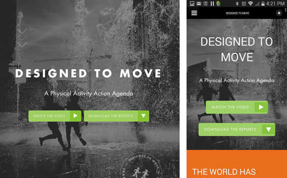
11. Designed to Move


The Extra Mile
And now we arrive at the crème de la crème. The designers attached to the production of these websites truly owe themselves several sturdy pats on the back.
These sites not only exude aesthetic eloquence, but they also translate animated effects, transitions, or alternate/more appropriate views as the screen resolution decreases.
We’ll take some time to discuss what sets them apart as we go.
13. Stories of Change


Stories of change made the list because of the hero images which take center stage on mobile, rather than implementing the cycling ambient video that renders on desktop. As an added bonus: the images change every time you refresh the page on your smartphone.
14. Fliks.co.uk


Flicks made just barely made the cut because the mobile site prompts you to find nearby theaters before sending you directly to the site.


I’m a sucker for ambient video and Vizio delivers, regardless of browser size. The mobile version skips all the flair and degrades to a usable navigation menu with a sexy image slider.
16. TheCreativeClassTV


Creative class loses points for automatically playing sound with its video, a pet peeve of mine, but it makes up for it with the sweet floating menu.
17. Etnies Marana-Bloodline landing page


The mobile version of the site switches backgrounds from black to white, in order to increase legibility, while still containing compressed variations of all the major elements of the desktop site.
1. Netwars Project


Netwars manages to keep a subtle animated effect on their background image even on the smartphone screen!


Gotta love these alternate views. The montage switches to slider in a smaller browser windows and you’ve got to scroll to get to the images, as the banner and CTA buttons are prioritized.
20. CinnamonToast


Cycling stop-motion animation across every view, and easy immediate navigation put CinnamonToast in a league of their own.
21. Honda CRV


Supremely subtle use of parallax scrolling and associated animations are preserved across all viewports, along with high definition background video. I want to buy a CRV now.
That’s all for our list. What are the most impressive responsive web designs you’ve seen implemented? Put your picks for the honorable mentions in the comment section.

Thanks for sharing!
Responsive website collection was unique and awesome . All the templates are designed perfectly