Why material design isn’t flat design: the differences, the specificities, and some examples of proper implementation.
According to Google’s official Introduction to Material Design, the goal they had in mind for the concept was to:
“Create a visual language that synthesizes classic principles of good design with the innovation and possibility of technology and science.”
…which is a really fancy way of saying nothing of substance.
Luckily, they end up elaborating. The idea is to create a single, unified system that works across multiple platforms. This “design language” took real world elements and interactions and digitized them into the trendy colors and images plastered all across the web today. This is a textured and subtle style that has a comprehensive set of guidelines, available here. Unfortunately, this introduction is filled with nonsensical sentences like:
“Dynamic elevation offsets are the goal elevation that a component moves towards, relative to the component’s resting state.”
While videos illustrating these obscure sentences go a long way in clarifying the Introduction’s content, those who aren’t so linguistically savvy are left wanting, thus the classic need for interpretation. And shamelessly borrowing from a well-known how-to book series, I’ve decided to try and shed some light on the various ins and outs of this poorly understood trend.
This is the cliff notes version of Material Design. Because we both know you have neither the time nor energy to try and parse through Google’s Silicon Valley hipster speak.
Let’s get started.
Material Maxims
Material is metaphor. Physical properties of the real world define the characteristics of material design. included to imply the manner of interactive elements. Particular emphasis has been placed on light, shadow, movement, and texture.
There are tons of subsets and interesting rules to go along with this maxim, but the main thing to remember, is anything that moves, any element on your webpage is “material,” and all that material has to follow a set of rules that emulates Newtonian physics. Material varies in height, width, shape, and elevation. It can generate or disappear spontaneously, and it always casts shadows.
Moreover, it can be used to display content. Imagery, text, video—anything you can think of, can be displayed and subsequently altered on a piece of material.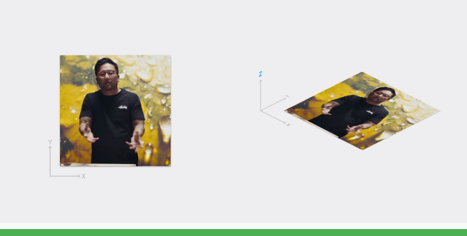
While material is extremely versatile, there are a few things (according to the Google guidelines) that it absolutely cannot do.
- Two pieces of material can’t occupy the same space at the same time
- Two pieces of material can’t pass through one another
- Material cannot bend or fold
- Material cannot alter its depth (1dp thick)
Beyond the properties of material, there are plenty of aesthetic choices that define the design. Here they are, quick and dirty:
- Bold colors
- Big graphics
- Obvious typographical hierarchies
- Calculated use of negative space
- User interactions denoted by movement
These characteristics should bring to mind another sort of design that resides firmly in the realm of two dimensions. But are they really the same thing?
Isn’t Material Design just a Dolled up Version of Flat?
It isn’t really flat, though it takes cues from flat philosophy. It’s certainly minimalist and it plays very well with mobile—two of the main goals of effective flat design. The differences become more apparent when you consider how Material design incorporates depth, 3 dimensions, and simulated objects from objective reality. It’s subtly skeuomorphic that way.
However, even Material design’s skeuomorphism shares a lot in common with flat design. That’s because the only form of realism that Material design tries to emulate is that which is represented in print media. By this I mean, that all of the analog elements in material design are based on paper representations. So while you will see some approximations of “real” elements in a Material design, it will still seem more illustrated than realistic.
Material Design: a Skeuomorphic/Flat Lovechild?
Material design is somewhat of an equal evolution between both flat and skeuomorphic design. As aforementioned, it takes many of its aesthetics from the dominant flat trend, while still incorporating some of the useful elements of skeuomorphism. From flat, Material design derives much of its color choices, preference for large graphics, and minimalism. From skeuomorphism it takes digital approximations of real-world objects as well as its system of physics. This pseudo-realism, however, is meant more for the creation of meaning than it is to apply a design style.
How does an approximation of the laws of physics create meaning? By avoiding confusion, displaying intention, and directing attention. The coordinated movement of elements guides users to a desired conclusion while eschewing visual overwhelm and frustration.
This is accomplished through ordered and hierarchical movement as well as speed variation. It might not be obvious when thinking about it, but symmetrical, linear movement can be quite jarring to the eye. It also makes it difficult to determine an object’s size and mass. Material design principles take all of this into account. All of this works together to give users the impression that material is following a set of “real” rules, just like physical objects. That’s what makes them, in a sense, skeuomorphic.
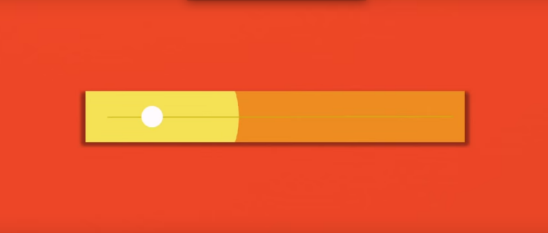
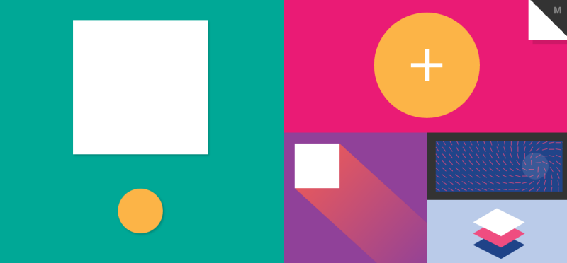
Here’s an animated example of both the flat and skeuomorphic principles in Material design in action:
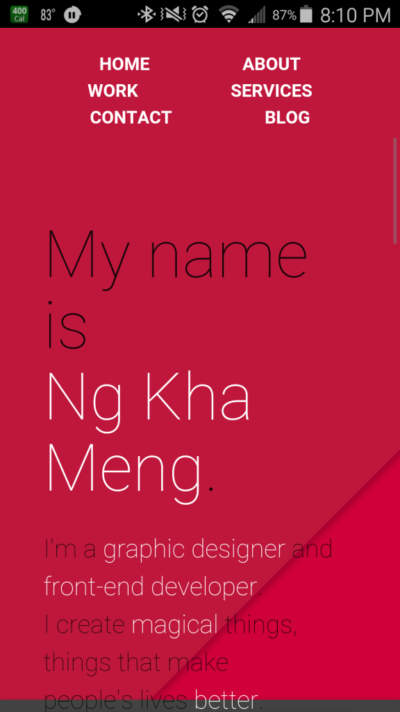
Or how about this awesome portfolio site from Ng Kha Meng.
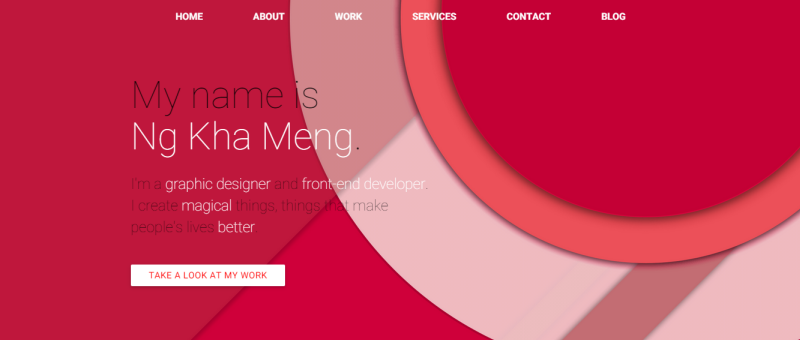
You can see an excellent use of overlap, shadow, and bold color as well as typographical hierarchy here. Dissecting it further you can observe the buttons which resemble those of a flat design along with 3 dimensional illusions which imply those selfsame skeuomorphic origins we’ve been discussing. An overall excellent representation of the primary virtues of Material design, and an excellent illustration of how the style evolved from its flat and skeuomorphic precursors.
It doesn’t look half bad on mobile either:
 .
.
Speaking of Mobile…
A Quick Note on Consistency
Though it’s interesting to dissect the origins of the trend, the real sticking point with Material design is its kinship with mobile devices. Recall that I mentioned one of the driving forces behind Material design’s inception was to create a single set of design guidelines to help create a unified experience across multiple platforms. Just like flat design, Material is aimed at being responsive to mobile users.
Moreover, it’s aimed at providing familiarity for those users, regardless of their viewports. This is especially important for Android developers as they have been reliably criticized for UI inconsistencies in their applications. Google app developers now have an easy reference for how to keep their interfaces attractive and consistent. This goes for both web and mobile apps, and it’s now much easier to implement similar interfaces across platforms due to new software provided by Google, called Polymer.
But enough talk. There’s no quicker way to learn about something than to experience it for yourself. Let’s have a look at some of the slickest examples of Material design around the web.
Material Design Gallery
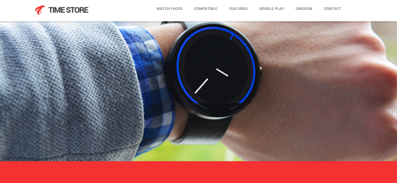
1. Time Store
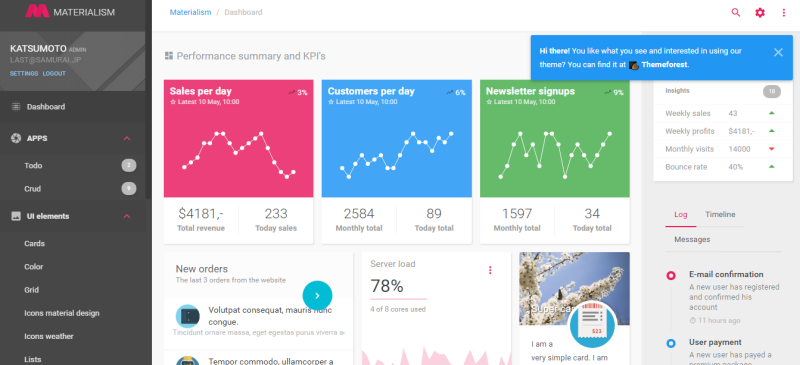
2. Materialism
3. Coders.pub

5. Appica 2
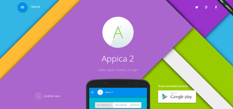
Conclusion
That’s the nutshell version of everything you really need to know about Material design. It’s a sleek, attractive, smooth and interesting new take on the two dominant web design & development trends of the last ten years. It offers consistency, fluidity, and most importantly a high standard of design aesthetics that focuses on classical design fundamentals.
Though there’s something to be said for differentiation in design, a uniform set of principles helps UX by increasing familiarity and making user interactions more intuitive.
Now that you’re a little more familiar with the subject, what do you think about Google’s little foray into design linguistics? Here to stay? Passing fashion trend? Leave your thoughts in the comments!


So in short it utilizes subtle shadows with a consistent light source. It’s not new, good designers threw the tackiness out of their shadows 10 years ago, toned them down for a while and then threw them out all together. Reading Google’s way of explaining this system is as entertaining as reading a medical study on dry skin.
google or not…material design is just moving that shadowed flat design into “actions” but of course since google is on it it will be supported as hell although it’s boring and basically it’s just a mix of metro and flat…which as we can see both are already going away and while kids will definetely love the material design, we all know that it will vanish in year or two as every other web design trend – even the responsive web design is already going away saying, that you should rather do it with some material framework and 2 years ago everyone said and was hella sure, that RWD is the only future…now because all of that “every day a new language” trend it rather looks that mobile and desktop will be separated again…it’s just business, as everything else, no innovation.
Google has defined design standards with Google Designs. The logical side feels like this makes sense, and who knows, one day this may be embedded with their search algorithms. The creative side feels like it squashes any future uniqueness and creativity. These standards almost removes that unique branding experience that is now trending. I feel like flat design is nothing new, just a tool used.
I think there are quite a lot of fundamental flaws in execution, especially on Google’s side… Which is serving as a reference to others.
1. Bad contrast, which is bad for accessibility and you can see that in the portfolio example. Another example is icons, which really look like someone is trying to sabotage the language at Google.
2. Extensive use of animation, which may provoke motion sickness or unease. Don’t forget a lot of users are reducing motion effects in iOS… But that you won’t be able to do on the web and this is a serious problem, especially with bold colors.
3. Artistic Homogeneity, which may create a very bland/weak visual culture. What is important is the conceptual homogeneity (how it works), not the visual one (how it looks).
4. I’ve never seen a company so arrogant when it comes to promoting a visual language. Never. Not even Apple. And this is bad news as it builds a system in which Google’s designers may not see flaws as flaws but as features.
5. Simplicity is very hard to achieve. Minimalism doesn’t ship with simplicity at its core and is pretty difficult to master too. By imposing this choice to an entire industry, you either end up with a weak culture in which everything looks like an hospital room or a transcendent blueprint (overuse of animations).
6. It was designed to solve the multiscreen problem and it fails to solve it. Period. A lot of apps and websites using Material Design are also slow to load, unresponsive to scroll, etc. the problem doesn’t lie in the visual language, it lies in optimization and the amount of craftmanship the maker is willing to put into.
7. Inconsistency is not solved by making apps that looks alike but use different colors. That is like overreacting, which leads to overconsistency, a system in which the user can’t tell which app he is actually using, make stuff he would do in another app (which is counterproductive considering the “action button”) and end up frustrated.
And that is the 7 sins of Material Design, I think. Once again, it’s all about execution, I don’t see any problems with principles.
+1